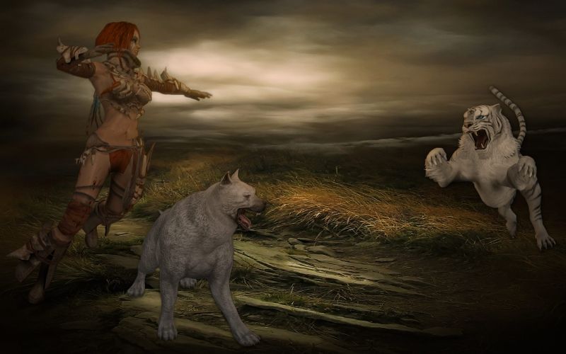
Attack of the White Tiger_WIP What do you think of this & would it qualify for the GUIC contest?
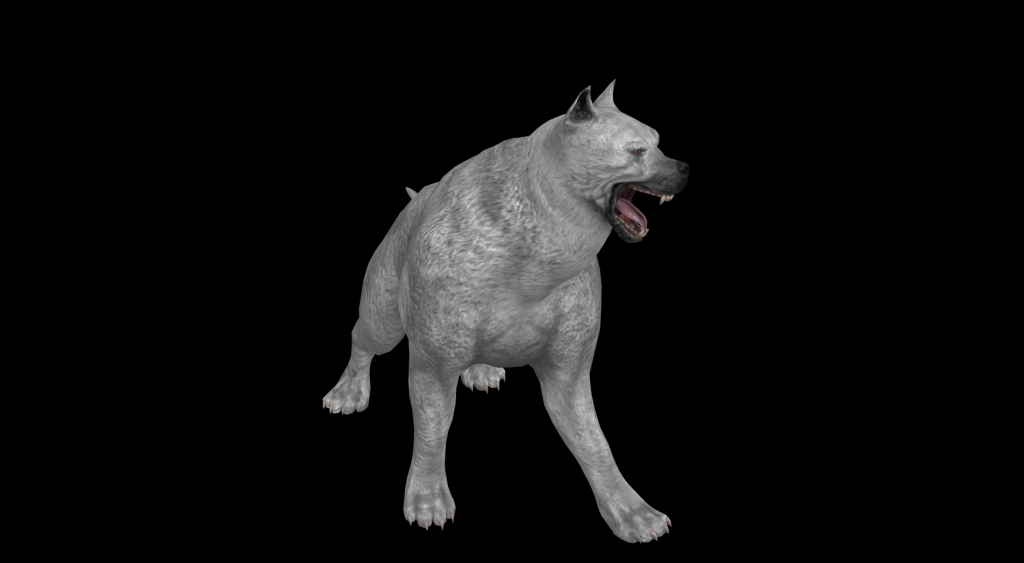
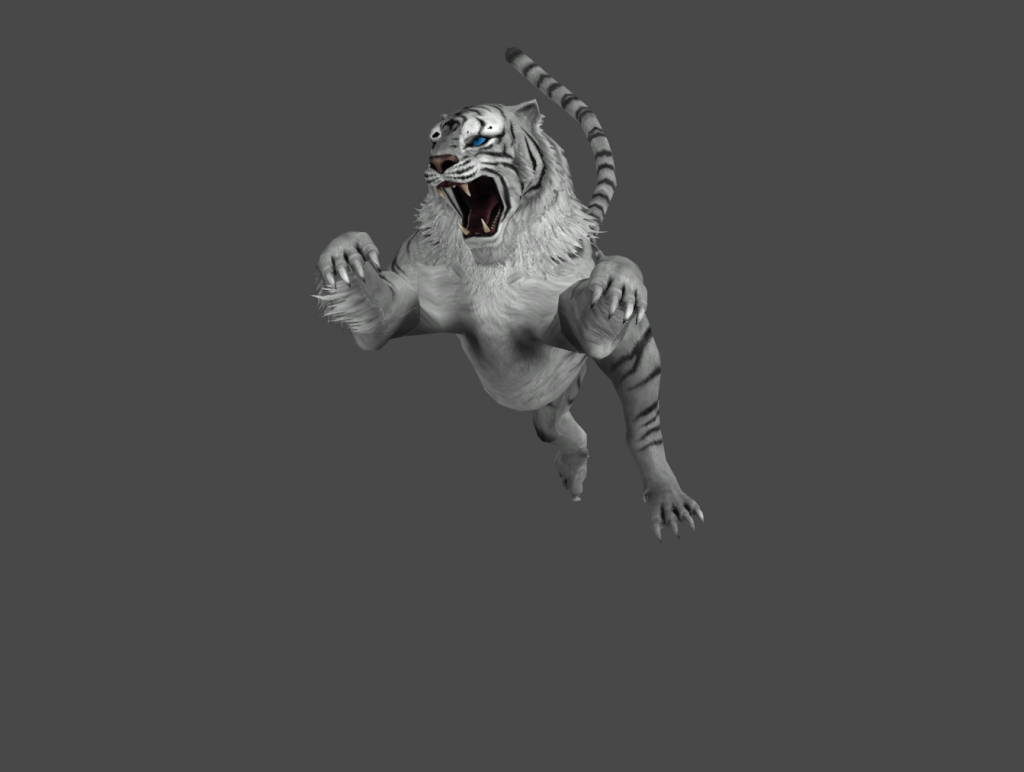
Thank you all for the input this really helps! The dog is a Warhound thus the oversized look and it is futher forward in the foreground. It had to be to be a dog of war and a formidable fighting companion. I wanted the tiger further back he is pouncing from the back. Was trying keep it situated as it was also to make logon so have to pay attension to charater location as the user icon could impair the display. If just for a wall then I wouldn't care about centering characters. Yes I do give credits & supply permissions tho they take many days, weeks, months to obtain sometimes. I have a backlog of multitudes of fantatic modded works that would go over well BUT I must wait! That is the curse and yes I am working my way up to creating my own characters. This composistional work helps me learn and I get help sometimes from the authors. A BIG PLUS for me. Advice is always welcome and yes stitching (sewing) the images into the theme is a very time consuming work which you must have great patience with in order for the theme to work.
Then perhaps some "Free Transform" and "Perspective" might help, as well as some "dodge on the left part of the chest and head... and a touch of selective blur to the tail and hind quarters?
Also, shadows cast on the ground would help. There are a couple of ways of doing it:
1) Duplicate the tiger and dog images with "Cntrl+J". Then, with the duplicated image's layer selected, do "alt+shift+back" and the image will turn black. The fill/opacity of that image can be changed and/or a gradient layer mask can be added (use the third one in the drop down menu and check "reverse").
or
2) Add a "drop shadow" from the fx button at the bottom of the Layers panel. In that window, make the opacity 100%. Then use the keyboard shortcut "v" to move the drop shadow away from the image. Now right click on the drop shadow listed under the layers thumbnail pic in the Layers panel and choose "Create Layer". A warning box will pop up, but disregard it because this works just fine for the drop shadow effect.
Then, all you need to pay attention to is the lighting source and perspective... as well as the layer stacking order (and labeling - a good habit).
The location of the shadow is effected with the "V" (move tool), and it's appearance with the perspective tool... adding a gradient layer to if necessary.
The edge of the shadow can be blurred using that tool.
Great!!! The Doc is in! I'm copying all that in case I have a senior moment- That's the kinda info that helps-fantasic Oh here's another WIP
https://dl.dropbox.com/u/13004762/Basilack_1920.bmp